Choosing Band Colours for Event Giveaways
Venue first, palette second. How the 12 standard silicone colours behave in daylight, which print colours stay readable, and how to match a Pantone reference.
Colour is the first thing a visitor registers about a wristband, often before they read the logo. Picking it from a brand guide alone usually leads to two problems: the band disappears against the venue, or the print disappears against the band. A short checklist solves most of it.
Start from the venue, not the palette
A band is seen in a specific place: a dim car meet, a bright outdoor expo, a hotel lobby, a school hall. Dark bands read well in daylight and vanish indoors. Bright bands photograph badly under warm lighting but stand out in a crowd. If you already know the venue, choose for that room rather than for a screen preview.
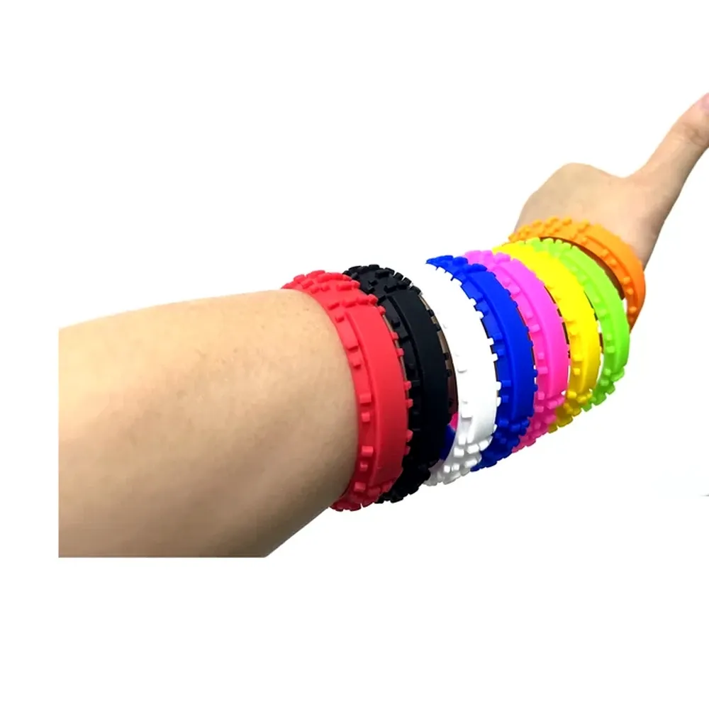
The 12 standard colours
Our standard colour card covers:
Colour — Reference
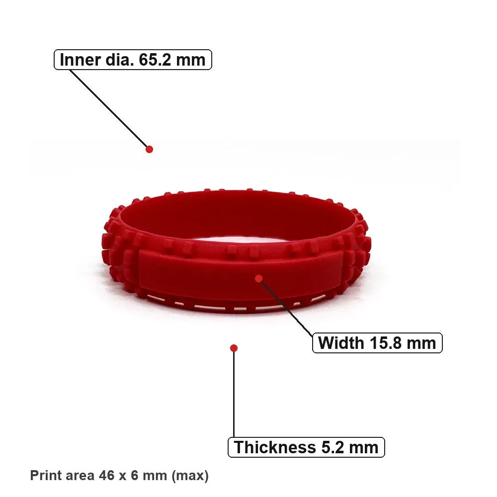
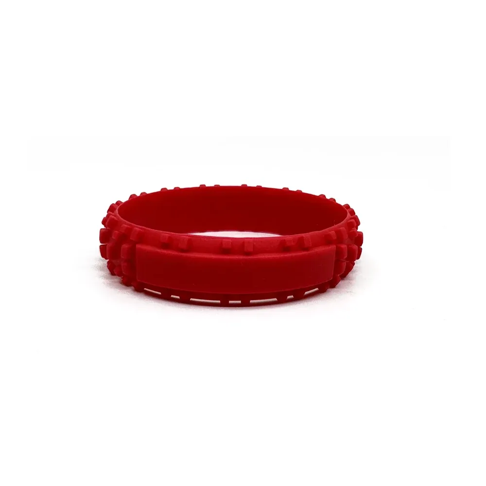
Red — 186C
Navy — —
Yellow — Yellow C
Green — 361C
Purple — 266C
Orange — 021C
Lake blue — 300C
Rose red — 233C
Pink — 210C
Sky blue — 283C
White — —
Black — —
Four of the twelve have no Pantone reference in the card. For those, ask for a physical sample before committing a large run; screen colour is not a reliable match.
High-contrast pairs that stay readable
Print sits directly on the band, so contrast between the two is the whole readability calculation.
• White or light print on black, navy or dark green: the safest combination for small logos
• Black print on yellow, white or light sky blue: strong at a distance
• Red band with white print: works well for promotions and sports
• Red print on a red or rose band: avoid — the logo reads as a smudge
• Yellow print on white: avoid — it disappears in daylight
If the brand colour is the band colour, print in white or black rather than a second brand colour. One clear contrast beats two competing ones.
Matching against a brand guide
Send the Pantone reference from your brand guide. We compare it against the current colour card and tell you the closest standard shade. If the match is not close enough, that is a conversation to have before production, not after.
A printed proof shows layout, not ink on silicone. For a brand-critical colour, ask for a sample band.
Ordering the same colour twice
Silicone colour can shift slightly between production runs. If you are ordering the same band for a series of events, order the full quantity in one run rather than topping up later. If a top-up is unavoidable, quote the original Pantone reference and the original order date so we can match against the same card.
Mixing colours in one order
Mixed colour orders are arranged to match the order. Tell us the split — for example 300 red, 200 black, 100 yellow — rather than a single total, so packing and colour setup are planned together.
Ask for the colour card
Send the event date, the venue type and the Pantone reference you are working from. We will confirm the closest standard shade, the contrast against your print colour, and the lead time for that combination.